
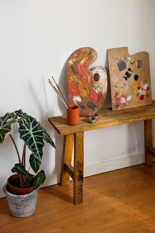
Creating a calming environment in your home starts with choosing the right colors. Colors have a significant impact on our mood and can make a space feel either energizing or soothing. If you want your home to be a peaceful retreat where you can relax and unwind, selecting calm colors is essential. In this post, we’ll explore practical tips and ideas to help you choose calm colors that bring harmony and comfort to your living spaces.
Why Choose Calm Colors?
Before diving into color selection, it’s helpful to understand why calm colors are beneficial. Calm colors tend to be soft, muted, or cool tones that have a soothing effect on the mind. They can reduce stress, enhance relaxation, and create an inviting atmosphere. These colors work well in bedrooms, living rooms, and bathrooms—places where you want to feel restful and at ease.
Understanding Color Psychology
Color psychology studies how colors affect emotions and behavior. While individual reactions can vary, certain colors are widely associated with calmness:
– Blues: Often linked to tranquility, blue resembles the sky and water, which are naturally calming.
– Greens: Symbolic of nature and renewal, green promotes relaxation and balance.
– Neutrals: Soft beige, ivory, and taupe provide a clean, peaceful backdrop that pairs well with many colors.
– Soft Pastels: Light shades of lavender, blush, or peach add a gentle warmth without overwhelming the senses.
Tips for Choosing Calm Colors for Your Home
1. Consider the Room’s Purpose
Think about how you will use each room when selecting colors. For example:
– Bedrooms: Soft blues, greens, or muted lavender can create a restful environment.
– Living Rooms: Warm neutrals combined with hints of soft blues or greens keep the space inviting yet calm.
– Bathrooms: Light seafoam green or pale blue evoke cleanliness and serenity.
– Home Office: Light shades of blue or gray can enhance focus without causing stress.
2. Test Samples in Natural Light
Colors look different depending on lighting. Paint a small section of your wall or use large swatches to test colors at various times of day. Natural sunlight brings out the true tone, while artificial light can change their appearance. Testing helps you avoid surprises and ensures the colors remain calming under your home’s lighting conditions.
3. Use a Simple Color Palette
Limit your palette to two or three calm colors to avoid visual clutter. Choose one main color and use the others for accents. This approach helps create a cohesive and relaxing atmosphere. For example, pair a soft gray with pale blue and white trim.
4. Incorporate Texture and Patterns
Calm colors don’t have to be plain. Use textured fabrics, subtle patterns, or decorative elements in similar shades to add interest without disrupting the peaceful vibe. Linen curtains, woven rugs, or lightly patterned wallpaper can enhance your calm color scheme.
5. Balance Cool and Warm Tones
While cool tones like blue and green are naturally calming, adding a touch of warmth can prevent the space from feeling too cold or sterile. Soft beiges or warm grays can complement cooler colors nicely and make rooms feel cozy.
6. Think About Finish and Sheen
The paint finish affects how colors appear. Matte or eggshell finishes typically reflect less light and help maintain a calm appearance. Glossy finishes can be too shiny and distracting for spaces meant to feel restful.
7. Coordinate with Existing Furnishings
Ensure your chosen colors work well with your furniture and decor. You don’t have to start from scratch, but picking calm colors that complement what you already have will create a harmonious environment.
Popular Calm Color Combinations
Here are a few tried-and-true combinations that work well in various rooms:
– Soft Blue and Warm Gray: Great for bedrooms or living areas to balance calmness and warmth.
– Sage Green and Cream: Ideal for kitchens and bathrooms where a fresh and natural vibe is desired.
– Pale Lavender and White: Adds a gentle and airy feel to bedrooms or reading nooks.
– Blush Pink and Taupe: A soft, inviting palette that works well in living rooms or entryways.
Final Thoughts
Choosing calm colors for your home is a rewarding way to enhance your living space and promote relaxation. Use these tips to thoughtfully select hues that suit your style and needs. Remember to test colors in your space, keep the palette simple, and balance tones for the best results. With the right colors, your home can become a peaceful haven where you enjoy comfort and calm every day.